
Deep Fathom /Brand Kit
Brand Kit.
Logos, colors, typography, and usage guidelines for partners, conferences, publishers, and press.
01/ Logotype
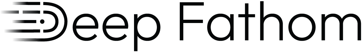
Logotype
The Deep Fathom logotype combines a refined brand type with a symbolic logomark to express motion and depth. Use the full logotype whenever space allows.


02/ Logomark
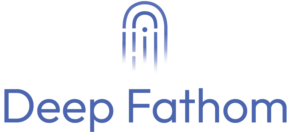
Logomark
The logomark is an abstract octopus form inspired by depth and discovery. Use it as a standalone symbol for digital surfaces, app icons, and tight spaces where minimal branding is required.


03/ Stacked
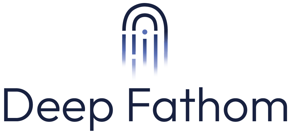
Stacked lockup
The stacked lockup pairs the logomark above the wordmark. Reach for it in square layouts, t-shirts, and conference signage.

04/ Color
Color palette
Dark, immersive, and illuminated by electric deep sea energy. Click any swatch to copy its hex.
04a/Primary palette
04b/Secondary palette
04c/Brand gradient
Hero gradient
Electric Blue (#00E9FF) to Primary Blue (#2050F2).
05/ Typography
Typography
Outfit is the brand typeface. Poppins is the web fallback when Outfit is not available.
Aa Bb Cc
Outfit · web fallback: Poppins
H1 · SemiBoldThe quick brown fox jumped over the lazy dog
H2 · ThinThe quick brown fox jumped over the lazy dog
H3 · BoldThe quick brown fox jumped over the lazy dog
Body · RegularThe quick brown fox jumped over the lazy dog
06/ Usage
Usage rules
A short list of do's and don'ts that keep the brand consistent across partners, conferences, and press.
Do
- Use the full Logotype whenever space allows.
- Keep clear space around the logo equal to the height of the “D” in Deep.
- Place the white variant on photographs or dark backgrounds with sufficient contrast.
- Maintain a minimum logotype width of 120 px for digital and 1 inch for print.
- Pair the brand with Outfit (or Poppins as a fallback web stack).
Don't
- Do not redraw, stretch, recolor, or rotate the logo.
- Do not place the logo on busy imagery without a contrast layer.
- Do not add drop shadows, outlines, or gradients to flat color variants.
- Do not crop the logomark or use partial elements of the logotype.
- Do not pair the logo with off-brand colors or non-approved typefaces.
07/ Contact
Need something custom?
For conference signage, co-marketing materials, press requests, or anything not covered here, get in touch.
Email hello@deepfathom.ai for high-resolution exports, vector source files, partner co-branding, and brand questions. We typically respond within one business day.